
In 2021 Piedmont was approached by RTI Surgical to help spin off their metals division into its own brand - Resolve Surgical Technologies.
With a decade of experience building brands for dozens of orthopedic practices across the United States, this was right in our wheelhouse.
THE BRAND

PIONEER SURGICAL
In its heyday Pioneer Surgical was the premier metals manufacturer for surgical instruments and implants for decades before being acquired by RTI Biologics in 2013 - becoming RTI Surgical. Initially we were brought on to reignite the Pioneer brand, bringing the name back into the forefront and updating the look for a modern era.

DISCOVERY
Our initial designs were focused on revitalizing the Pioneer brand, with a mission of keeping the logo clean and simple. We like to start with simple changes first - in this case removing “the wand” from the original logo and simplifying down to cleaned up versions of the original swoops. Other wordmark designs were also introduced, highlighting the forward momentum and nature of their “quick to market” PLOEM model.


SWOOP THERE IT IS.
Once the team had settled on the idea of a traditional logo with an icon and supporting text, we went into a sort of swoop discovery process. We wanted to keep the original 2-line swoop in tact, but also provided options that added tertiary colors as well as gradients.

WHAT’S IN A NAME
Around the time we were finishing up designing the initial round of swoops, potential bad news came calling for the client. Unfortunately the Pioneer Brand Name was no longer going to be an option (I’m not a lawyer, so don’t ask me). So we began looking at alternative names for the new business.

RESOLVE
Once a name had been finalized we were able to narrow down the swoop choices to these two. One, a softer, more fluid approach and one an angular, more rigid design.

The Final Logo
The softer approach was eventually approved and the name finalized to Resolve Surgical Technologies.
THE VISUAL SYSTEM
One of the most important aspects of a good brand is how it’s carried out across it’s major touchpoints. The Visual System - Business cards, letterhead, signage, etc - are often the first and most commonly seen representations of your brand. A clear Visual System will support the brand in the long-term and set the tone for all future projects. We like to think of the Visual System as a living Brand Guide.

Visual systems are also highly effective sales tools, so when it came to crafting one for Resolve, who has a very niche client base, we knew thank you cards and car wraps weren’t going to cut it.
So we established an external messaging template system for communications, presentation decks for sales, internal signage and trade show materials that helped establish the new brand quickly in areas where potential clients and investors would see it.


We also made a lot of powerpoint layouts. A LOT.

THE DIGITAL SPACE
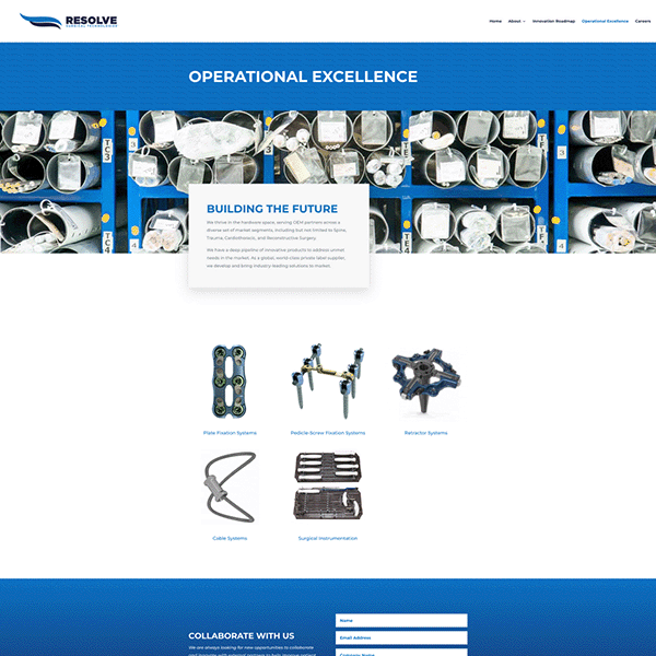
With print work complete, we shifted our focus to the digital landscape using a three-pronged approach. The primary focus would be a new website clearly separating Resolve from its predecessor with social engagement via Linkedin and Email campaigns supporting the message that the pride of Marquette, MI had returned with a force.

We also made this fun little “Tour of Marquette” video, showcasing the main headquarters. For those of us with orthopedic backgrounds, this is pretty neat stuff.
THE VIDEO
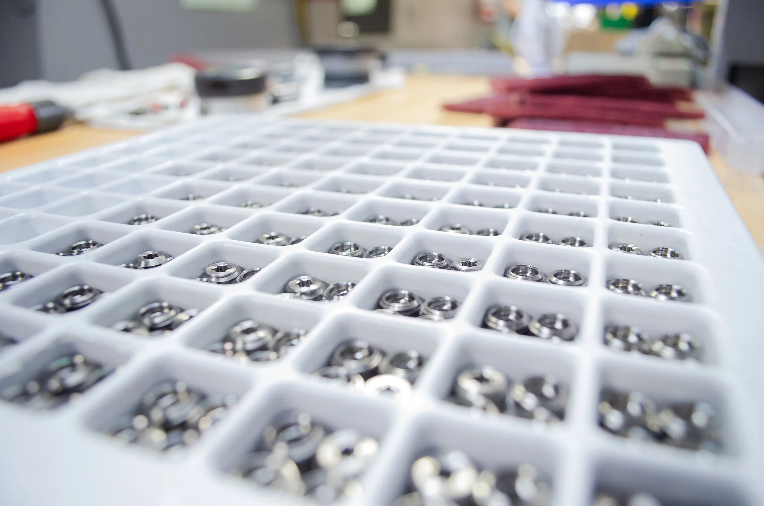
In 2024 we began offering video services to all of our clients and Resolve immediately took interest. Shooting video for them was the perfect way to showcase their CDMO+ model that is unique to them. Resolve is unique in their field, in that, every part of the process from concept to final product is done under one roof. Companies who compete with Resolve don’t have that capability. One department designs concepts then sends it to off to get a prototype made, then they send it off to be tested, then they start the process all over again. Resolve eliminates the time spent by their competitors by utilizing this model, so we used video to put that on display for their clients and partners to see.
We then went a step further and captured a full process video for Resolve. We captured exactly what it’s like to go through the process of bringing a product from concept to finish all using the CDMO+ model. In this video we highlight Resolve’s ability to seamlessly communicate and efficiently develop their products all in house.
TL;DR
When we began working with Resolve Surgical Technologies, we focused on the must-do tasks in order to meet the company’s short-term goals, then fleshed out the brand over the last few months, never losing sight of the initial strategy we enacted. In the end, the success of this brand will ultimately come down to two factors: How the client utilizes the brand and how Piedmont supports the client’s initiatives.
KEY TAKEAWAYS:
1) Being consistent is crucial when establishing a new brand.
2) Having a defined process from the onset creates an environment of trust for all parties.
3) Building relationships is more important than building logos, websites, videos or visual systems.